Overview
After running a Network Design study, the system analyzes historical freight activity and generates an optimized view of your network. The results identify core lanes, complementary empty lane opportunities, bid opportunities, and multi-lane tours (cycles) that can improve network efficiency.
Each result area includes both map-based visualization and detailed statistical tables, allowing planners to evaluate how freight flows between markets and identify opportunities to reduce empty miles.
When to Use It
Review Network Design study results when you want to:
-
Identify high-volume lanes supported by historical freight activity
-
Discover complementary empty lane opportunities
-
Evaluate potential bid lanes
-
Design multi-lane cycles for drivers
-
Understand market balance between inbound and outbound freight
-
Export data to support network planning or contract bidding
Step-by-Step Instructions
1. Open the Completed Study
Navigate to the Network Design module and open the study you previously optimized.

At the top of the study you will see several result sections:
-
Trends
-
Markets
-
Lanes
-
Bids
-
Cycles
These tabs represent different ways to analyze the optimized network.
2. Review the Trends Dashboard
The Trends dashboard provides a summary view of the study results and helps you quickly understand the size, performance, and makeup of the optimized network before reviewing individual Markets, Lanes, Bids, or Cycles.
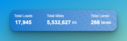
At the top of the dashboard, summary tiles show overall study totals such as:
-
Total Loads
-
Total Miles
-
Total Lanes
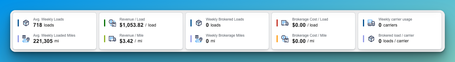
Additional KPI cards show weekly averages and financial metrics, including:
-
Average Weekly Loads
-
Average Weekly Loaded Miles
-
Revenue per Load
-
Revenue per Mile
-
Weekly Brokered Loads
-
Weekly Brokerage Miles
-
Brokerage Cost per Load
-
Brokerage Cost per Mile
-
Weekly Carrier Usage
-
Brokered Loads per Carrier
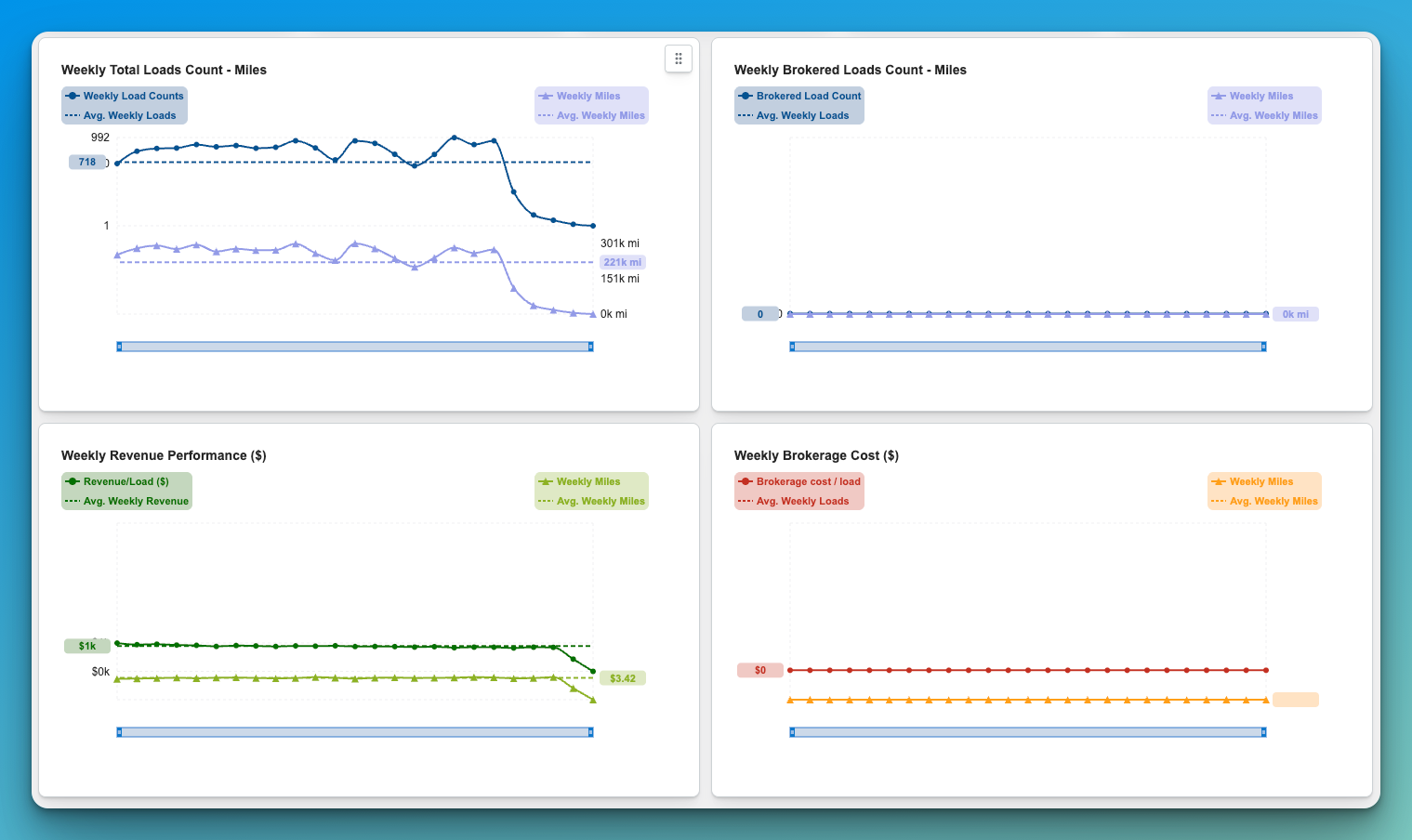
Below the KPI cards, trend charts display performance across the study period, including:
-
Weekly Total Loads Count and Miles
-
Weekly Brokered Loads Count and Miles
-
Weekly Revenue Performance
-
Weekly Brokerage Cost
Use the Trends dashboard to quickly identify:
-
overall network size
-
historical volume consistency
-
revenue performance over time
-
brokerage dependence
-
shifts in weekly load and mile patterns
This view is especially useful for understanding whether the study reflects a stable recurring network or a more volatile network with changing volume patterns.
Tips or Notes for Trends
-
The Trends dashboard is the best place to start when reviewing a completed study.
-
Large swings in weekly loads or miles may indicate seasonality, customer concentration, or irregular freight patterns.
-
Revenue and brokerage metrics help users evaluate not just reproducibility, but also the financial quality of the network.
-
As future enhancements are added, this dashboard will become even more valuable for identifying the most profitable and repeatable opportunities.
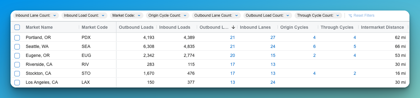
3. Review Market Analysis
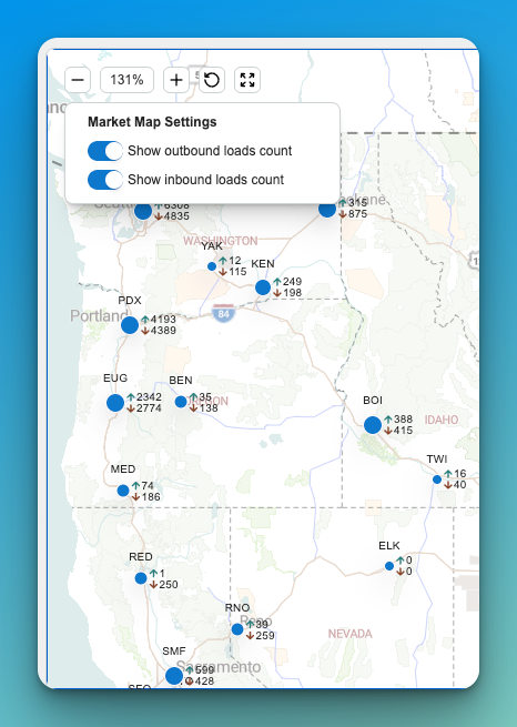
The Markets view summarizes freight activity across geographic hubs.
The map displays market locations and the directional flow of loads between them.
Key metrics typically include:
-
Outbound Loads – Number of loads leaving the market
-
Inbound Loads – Number of loads entering the market
-
Outbound Lanes – Active lanes originating from the market
-
Inbound Lanes – Active lanes terminating at the market
-
Origin Cycles – Tours beginning from the market
-
Through Cycles – Tours passing through the market
Use this view to identify balanced vs. imbalanced markets and understand where freight naturally concentrates.
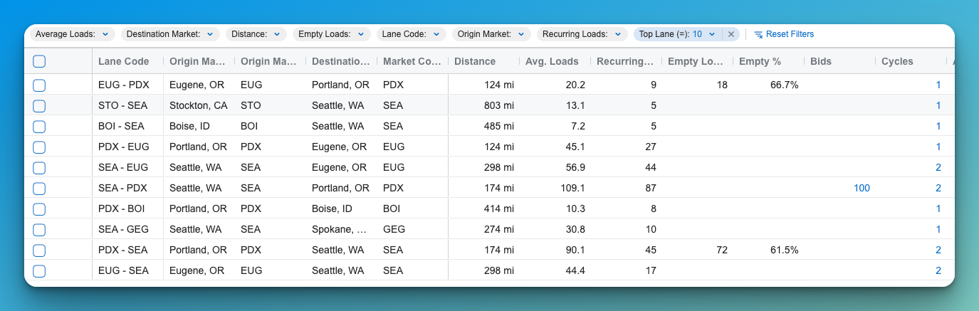
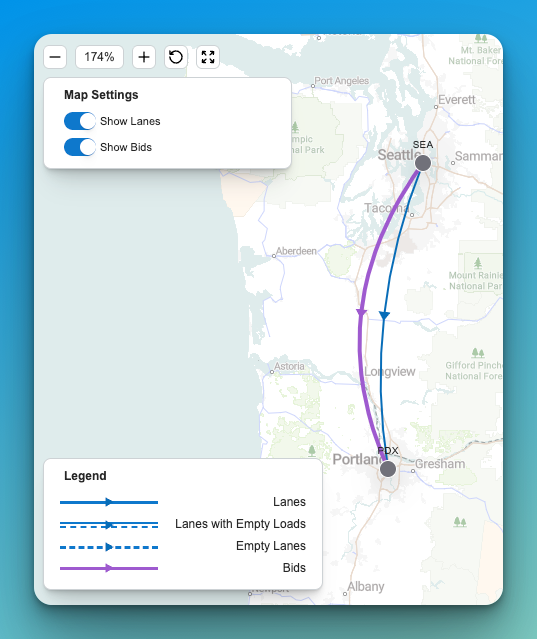
3. Analyze Network Lanes
The Lanes view shows freight flows between markets that meet the system’s volume thresholds.
The map visualizes directional lanes between markets, while the table provides detailed statistics.
Common lane metrics include:
-
Distance
-
Average Loads
-
Recurring Loads
-
Empty Loads
-
Empty Percentage
-
Bid Opportunities
-
Customers
-
Carriers
-
Total Loads
Lanes with higher recurring loads generally represent stable freight corridors, while lanes with higher empty percentages may indicate opportunities to improve network balance.
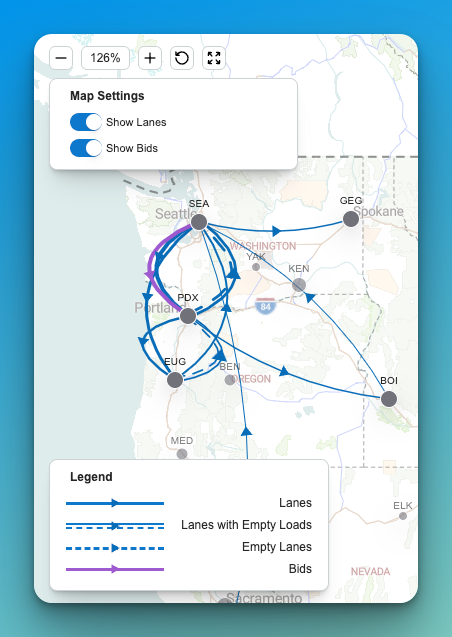
4. Review Bid Opportunities
The Bids view highlights potential lane opportunities where contract freight demand may exist.
The map displays bid routes alongside existing freight flows and empty complimentary lanes, allowing planners to compare current network activity with market opportunities.
This analysis can help identify:
-
Strategic lane expansion opportunities
-
Markets where additional contract freight could improve network balance
-
Potential new bid lanes during contract negotiations
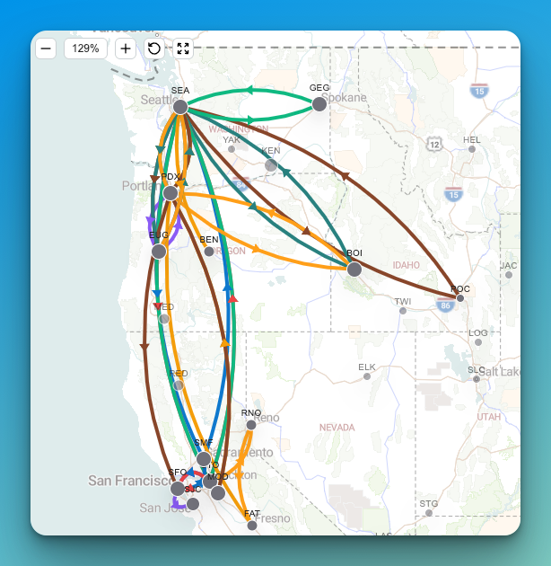
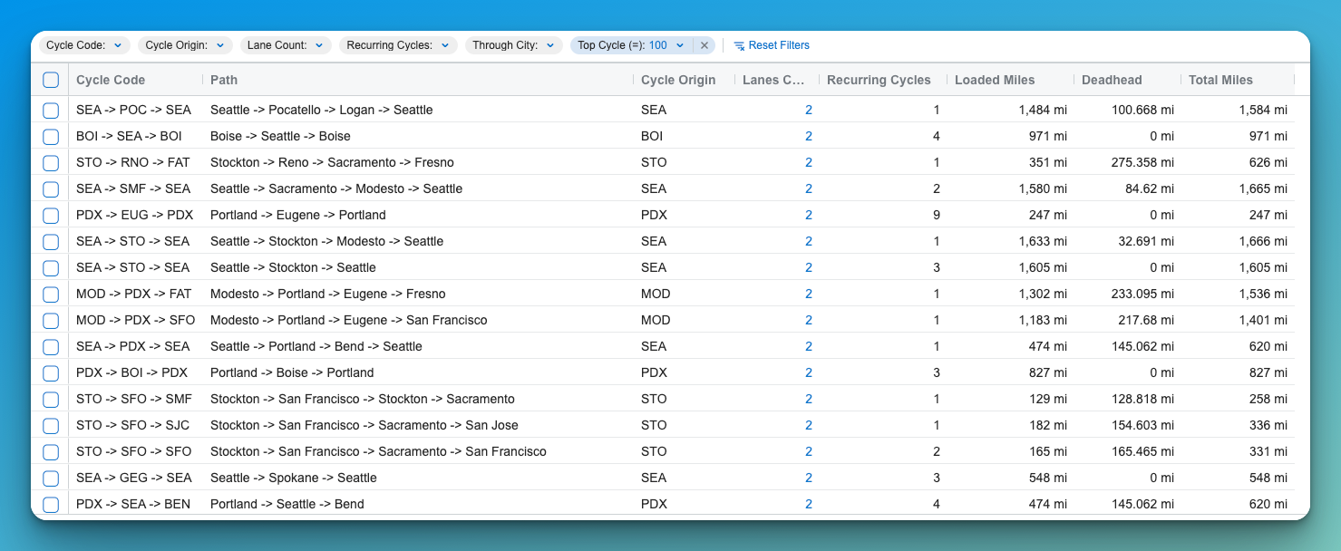
5. Evaluate Network Cycles (Tours)
The Cycles view identifies multi-lane tours that reduce deadhead and improve equipment utilization.
A cycle represents a sequence of lanes that begins and ends in the same market.
For example:
Seattle → Portland → Eugene → Seattle
Cycle metrics include:
-
Lane Count – Number of lanes in the tour
-
Recurring Cycles – How often the pattern occurs
-
Loaded Miles
-
Deadhead Miles
-
Total Miles
Cycles help planners design driver-friendly tours that minimize empty miles while maintaining consistent freight flow.
6. Use Map and Table Views Together
Every results section includes two complementary views:
Map View
Shows the geographic relationships between markets and lanes. This view is useful for understanding regional freight flow and identifying network clusters.
Data Grid
Provides detailed numerical metrics that allow planners to evaluate volume, utilization, and opportunities.
Using both views together helps reveal patterns that may not be obvious from data alone.
7. Export Network Reports
You can export the study results to generate reports that summarize network performance.
Exports typically include:
-
Lane volume metrics
-
Empty mile opportunities
-
Cycle efficiency
-
Market activity
-
Bid lane opportunities
These reports can be used for network planning, operational reviews, or contract bid preparation.

Tips or Notes
-
Studies based on 12 months of historical data generally produce the most reliable network insights but if data is not consistent, focused smaller studies can result in better production of cycles.
-
High empty lane percentages often indicate opportunities to improve tour structures.
-
Cycles with minimal deadhead typically represent the most operationally efficient tours.
-
Exported reports are useful for sharing results with operations, sales, or leadership teams.